The Archives
Archaic Clothing Co.
Client: ACC
Year: 2020
Services: Brand Identity
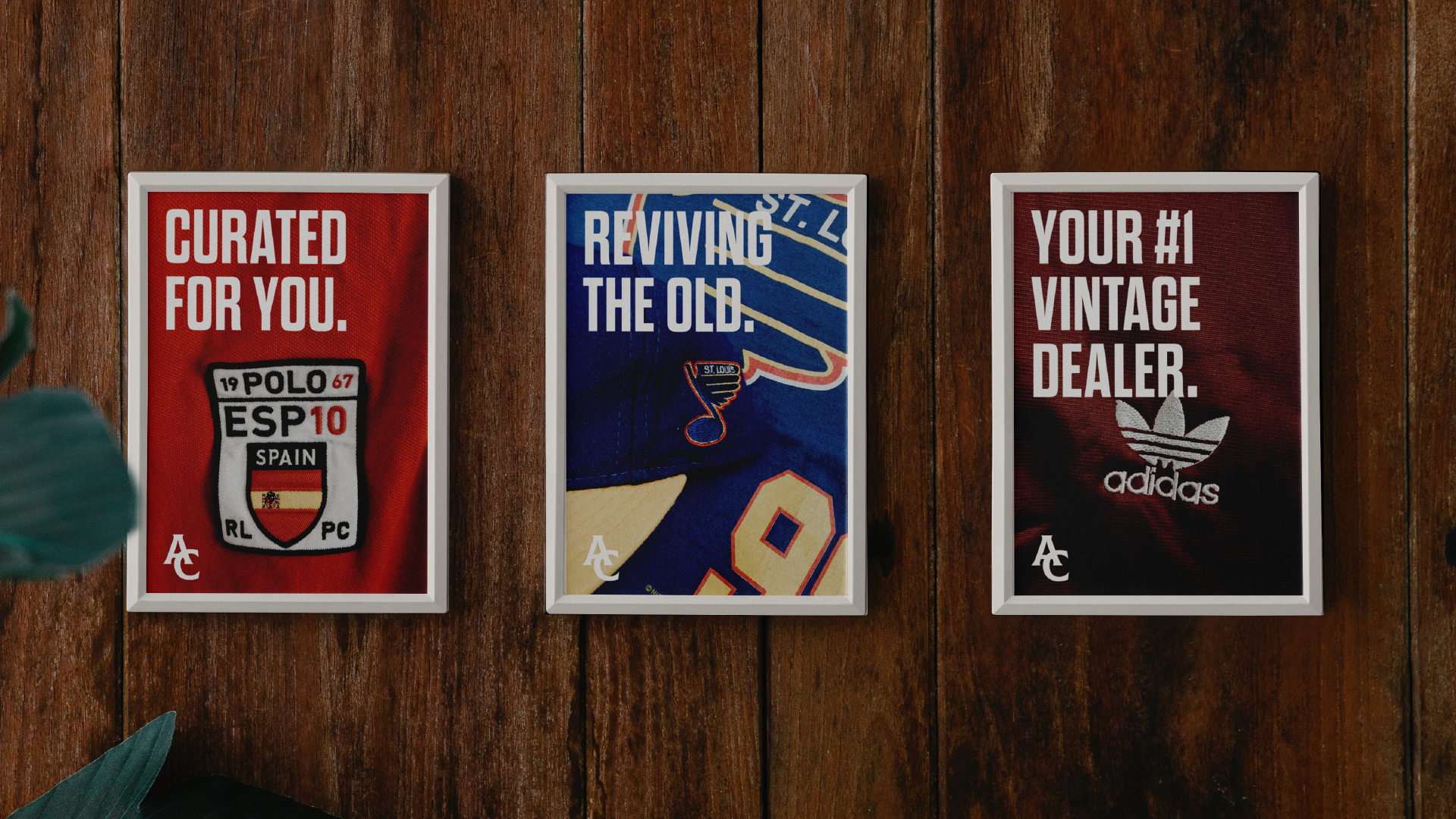
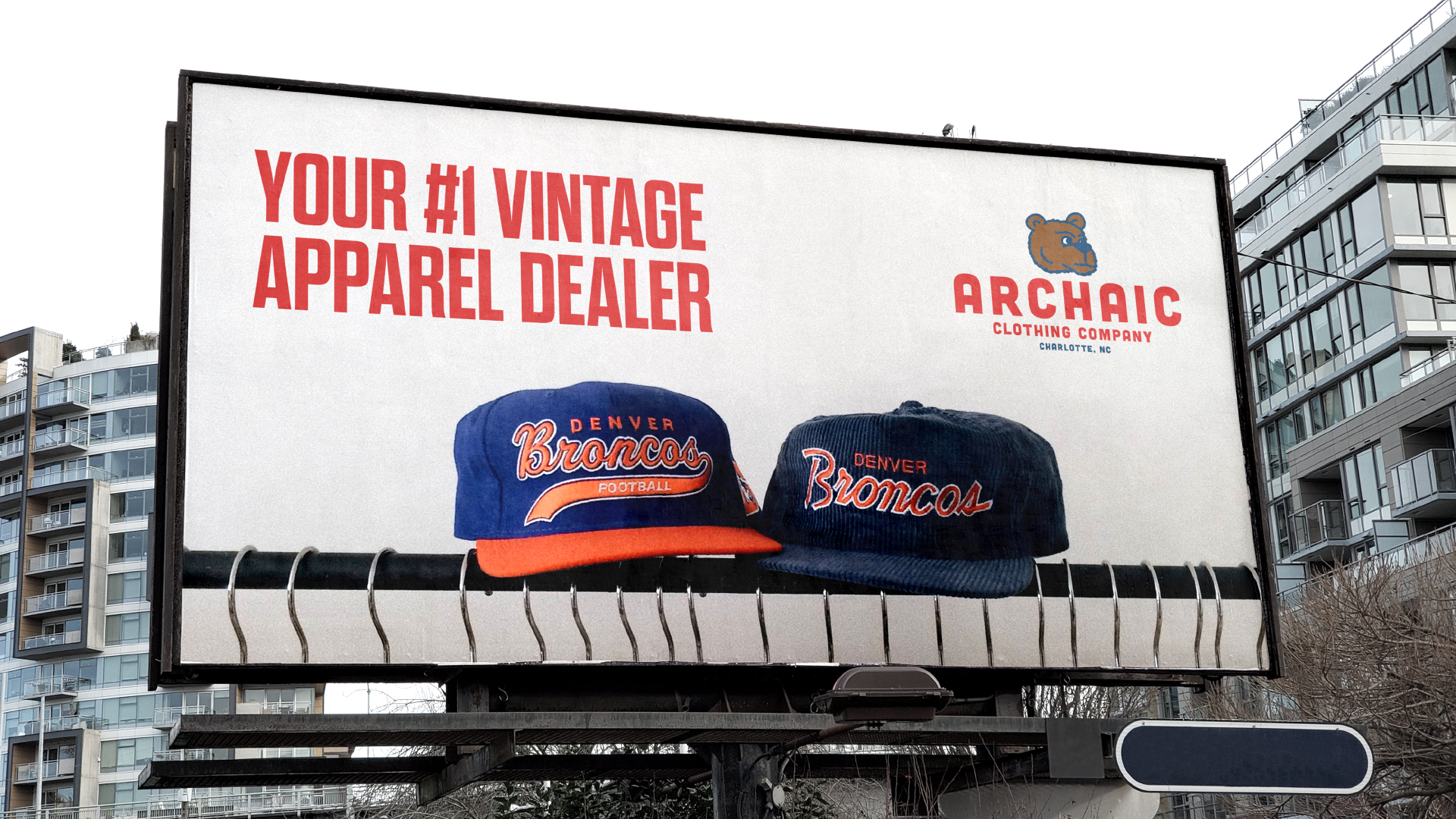
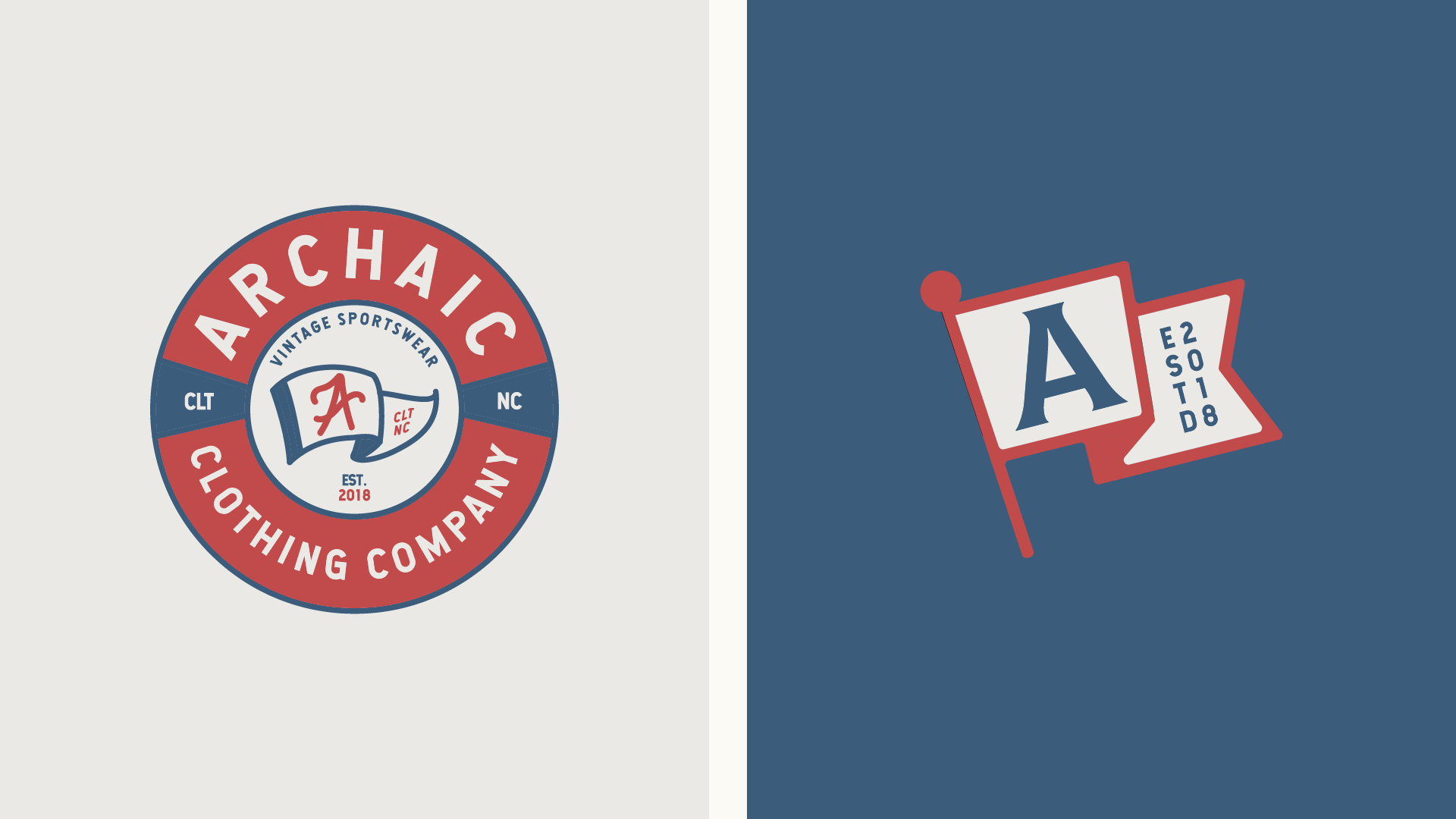
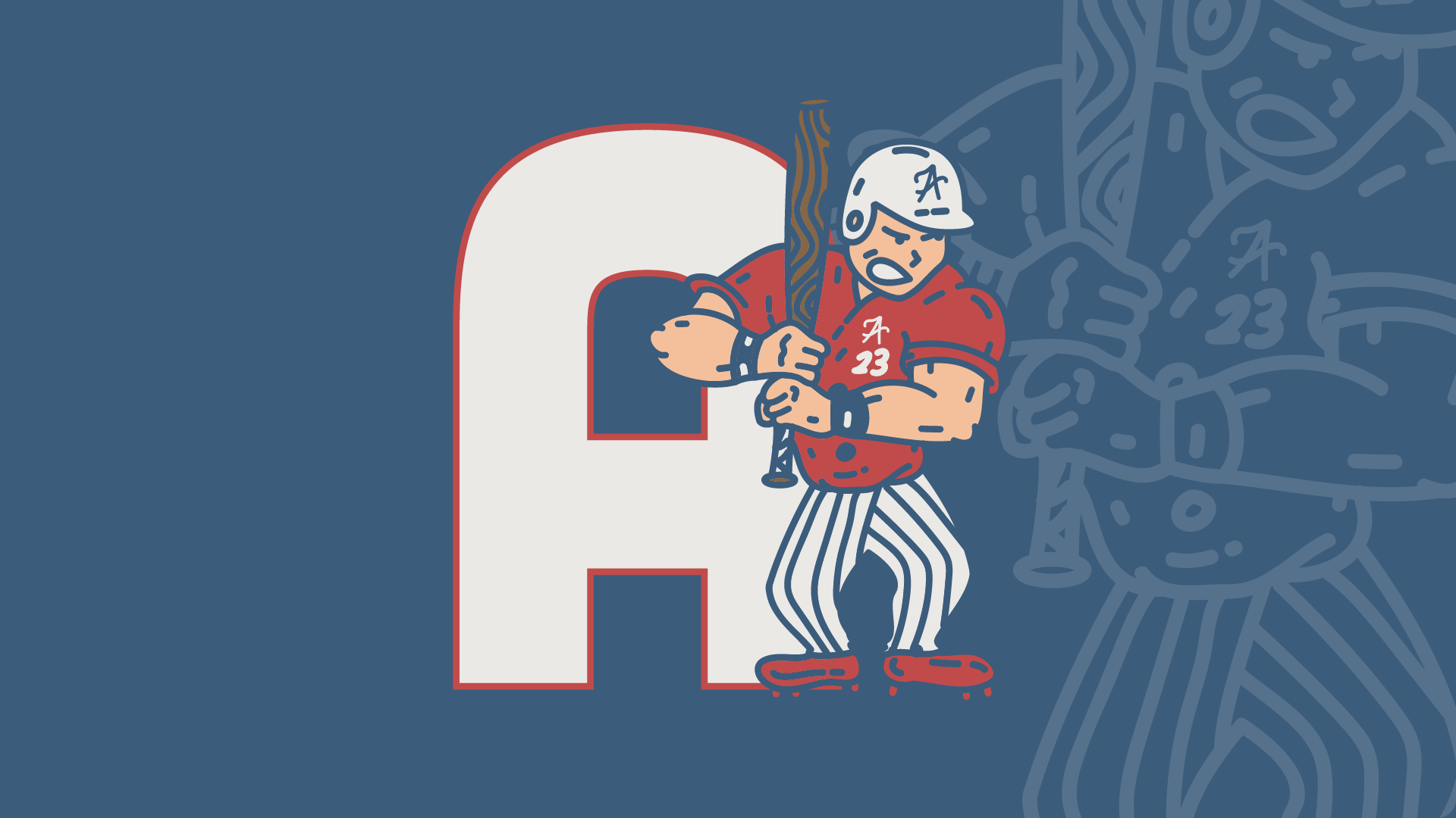
Archaic Clothing Co. is a second hand vintage sportswear brand, curating and reselling vintage sports gear from all over the US. Founded in 2015, the company has become a trusted name for enthusiasts and all sports fans alike seeking nostalgic gear of their favorite teams. Through strategic use of online platforms such as Etsy and Shopify along with social media marketing, Archaic Clothing Co. has built a loyal customer base that builds community through sports. This brief case study delves into Archaic Clothing Co.'s brand identity, marketing initiatives, and all the other assets ErvinJohn created.




Colony House
Client: -
Year: 2021
Services: Campaign Identity Print Design
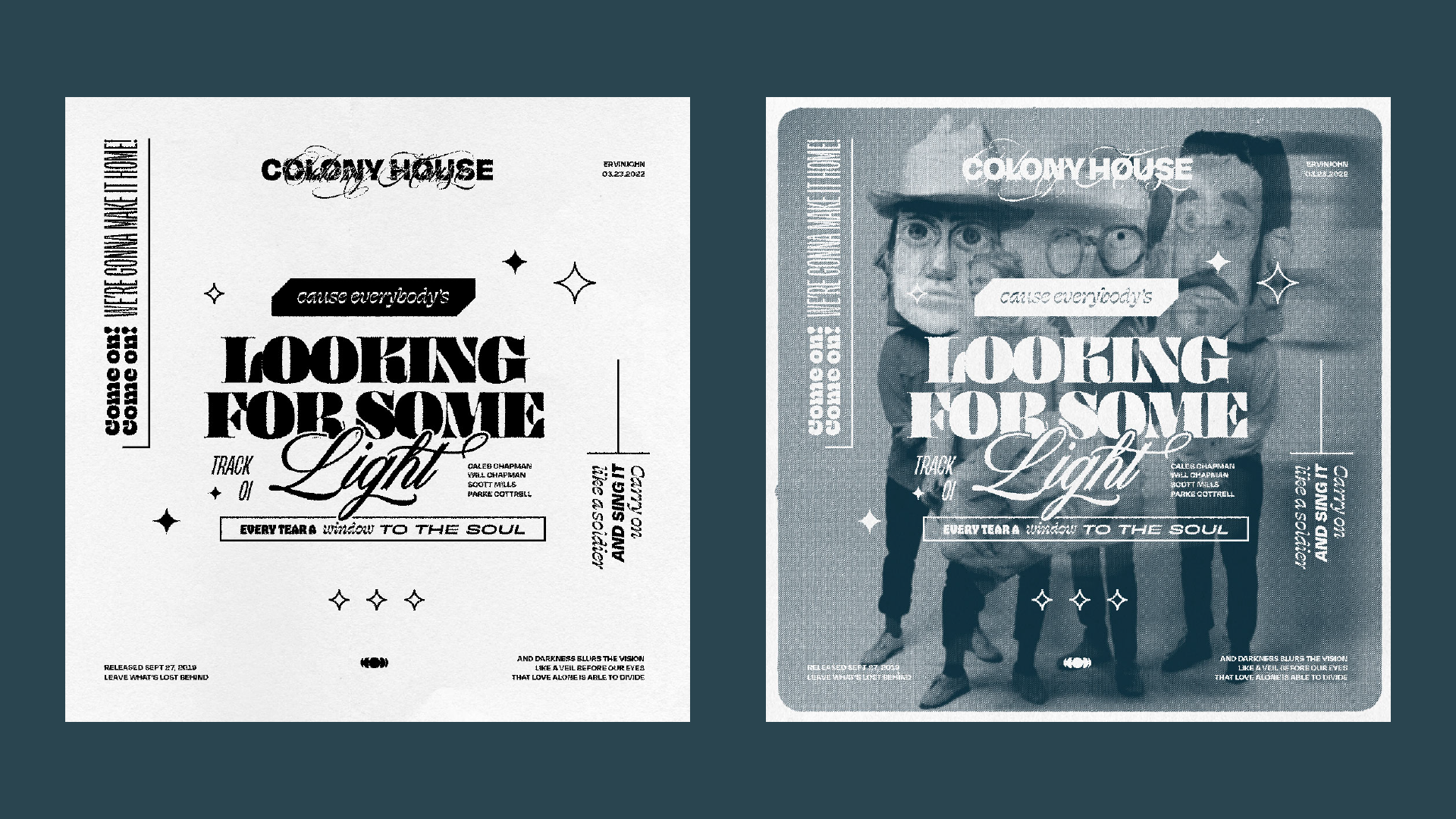
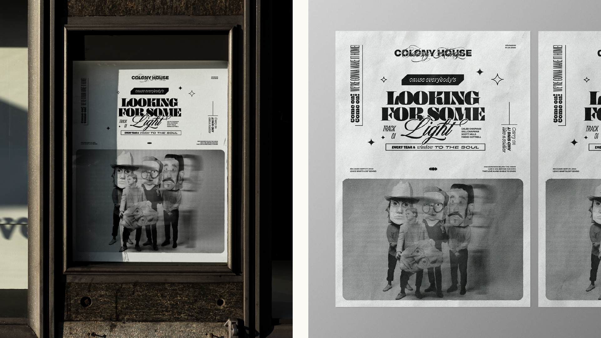
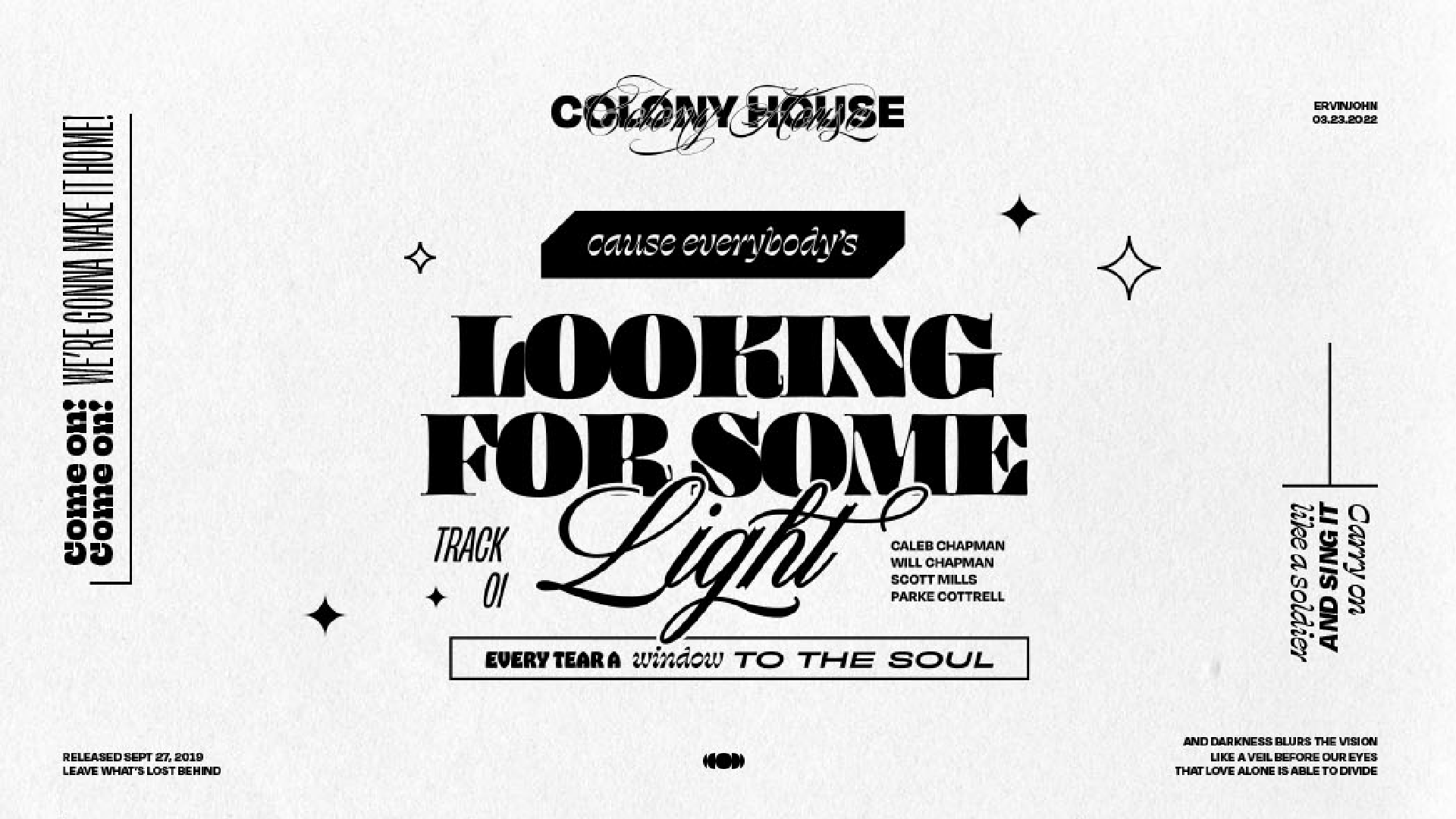
Poster and lyric graphic for the indie rock band Colony House. Crafted to capture the band's energetic and eclectic sound through bold typography and vibrant imagery. This poster design incorporates elements that reflect Colony House's unique identity, resonating with their fan base and enhancing their visual branding. By analyzing the poster's conception, design choices, and the subsequent reception from both fans and the band, this brief case study illustrates the power of effective visual communication in the music industry.


Covid Illustrations
Client: -
Year: 2020
Services: Brand Identity Illustration
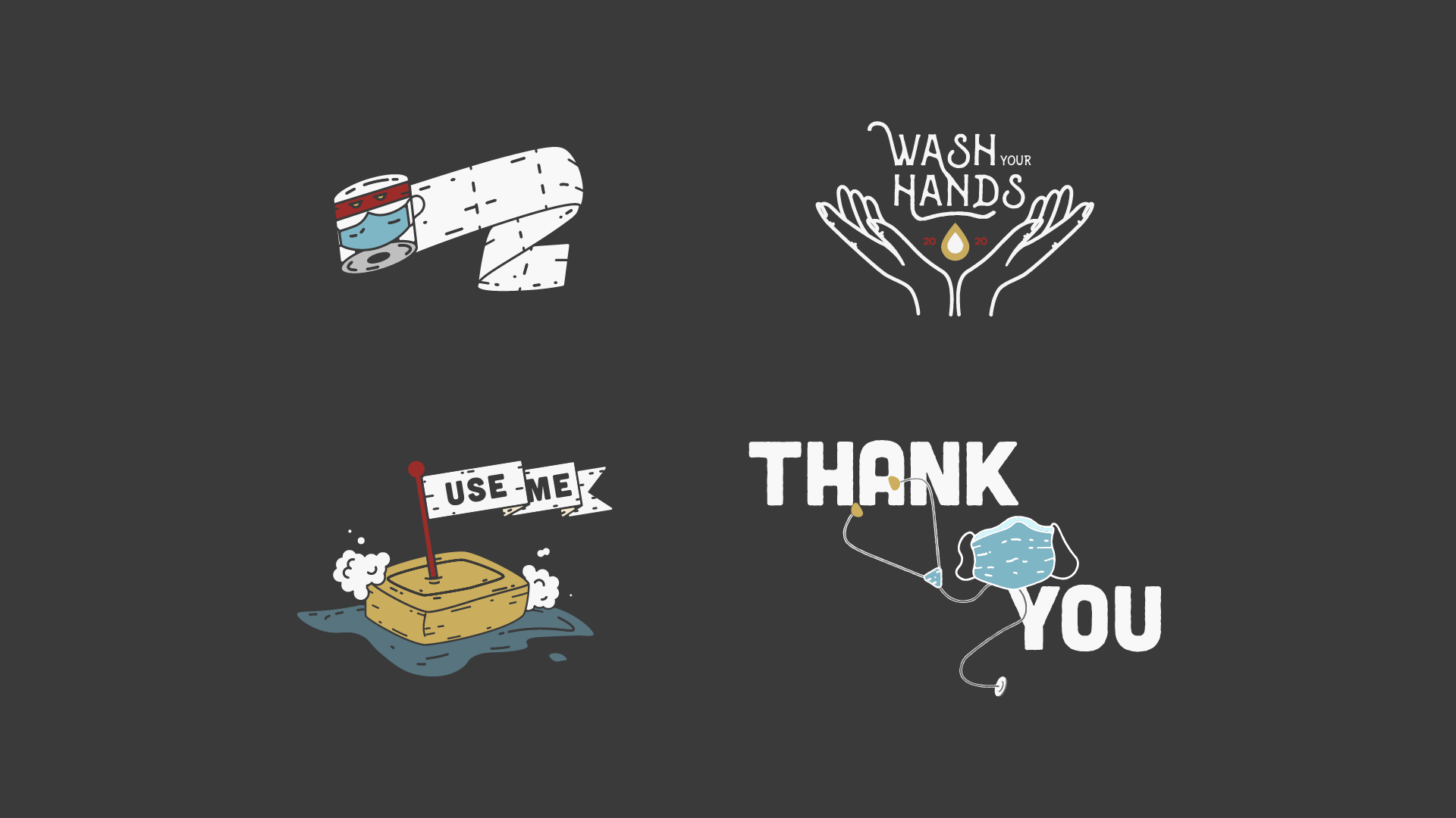
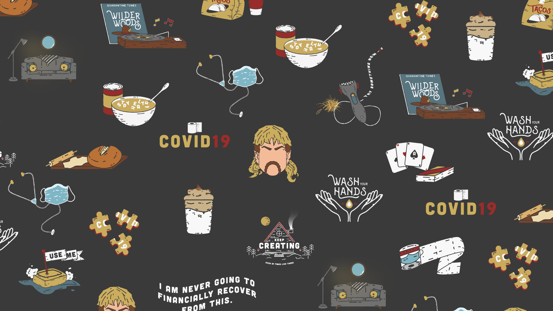
The collection of covid illustrations came from an exploration state during the COVID-19 pandemic, aiming to convey the multifaceted experiences and emotions of this unprecedented time. These retro spot illustrations capture key themes such as resilience, isolation, community support, and hope. Each piece in the collection uses a distinctive subject tied together by art style and color palette to evoke empathy and reflection.




DTWD
Client: -
Year: 2021
Services: Character Illustration
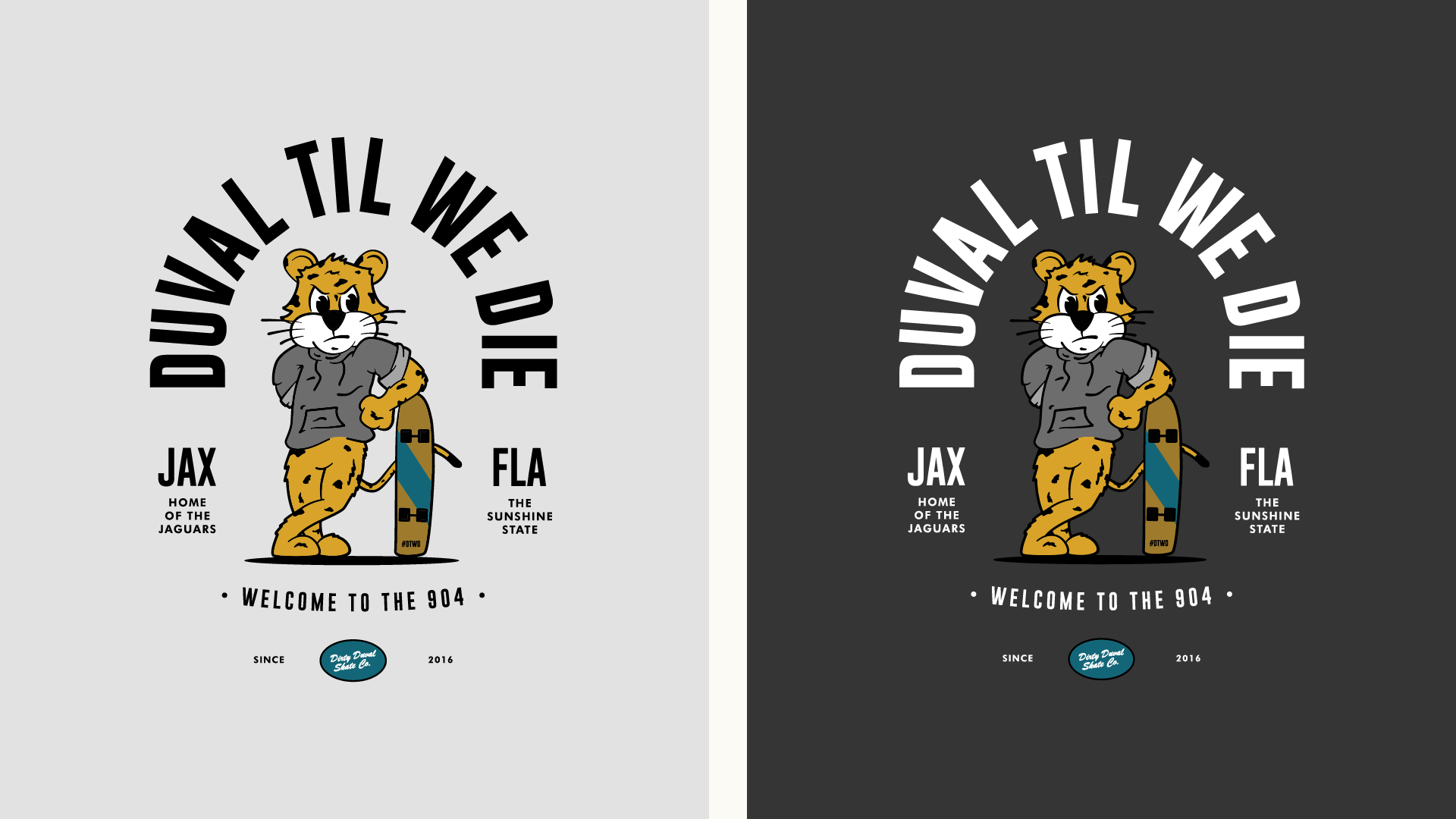
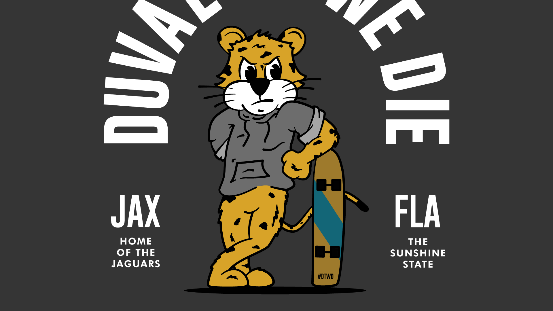
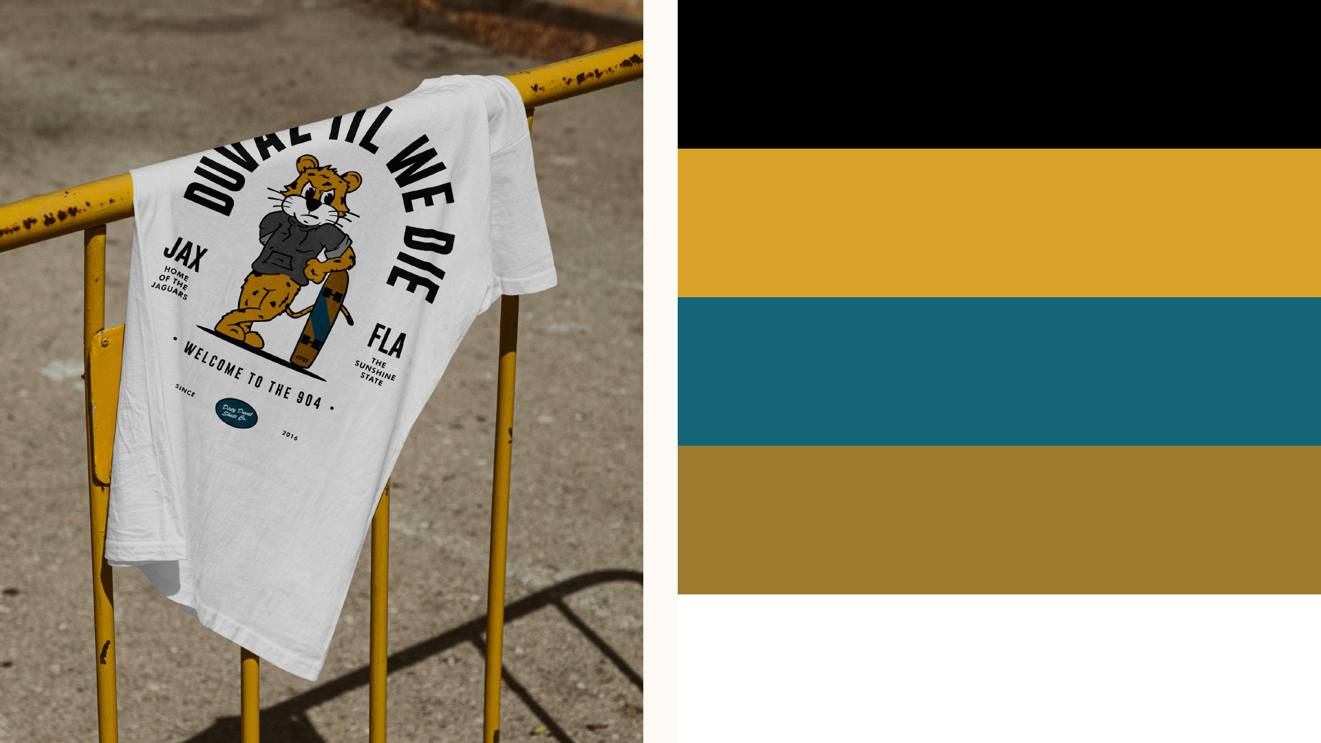
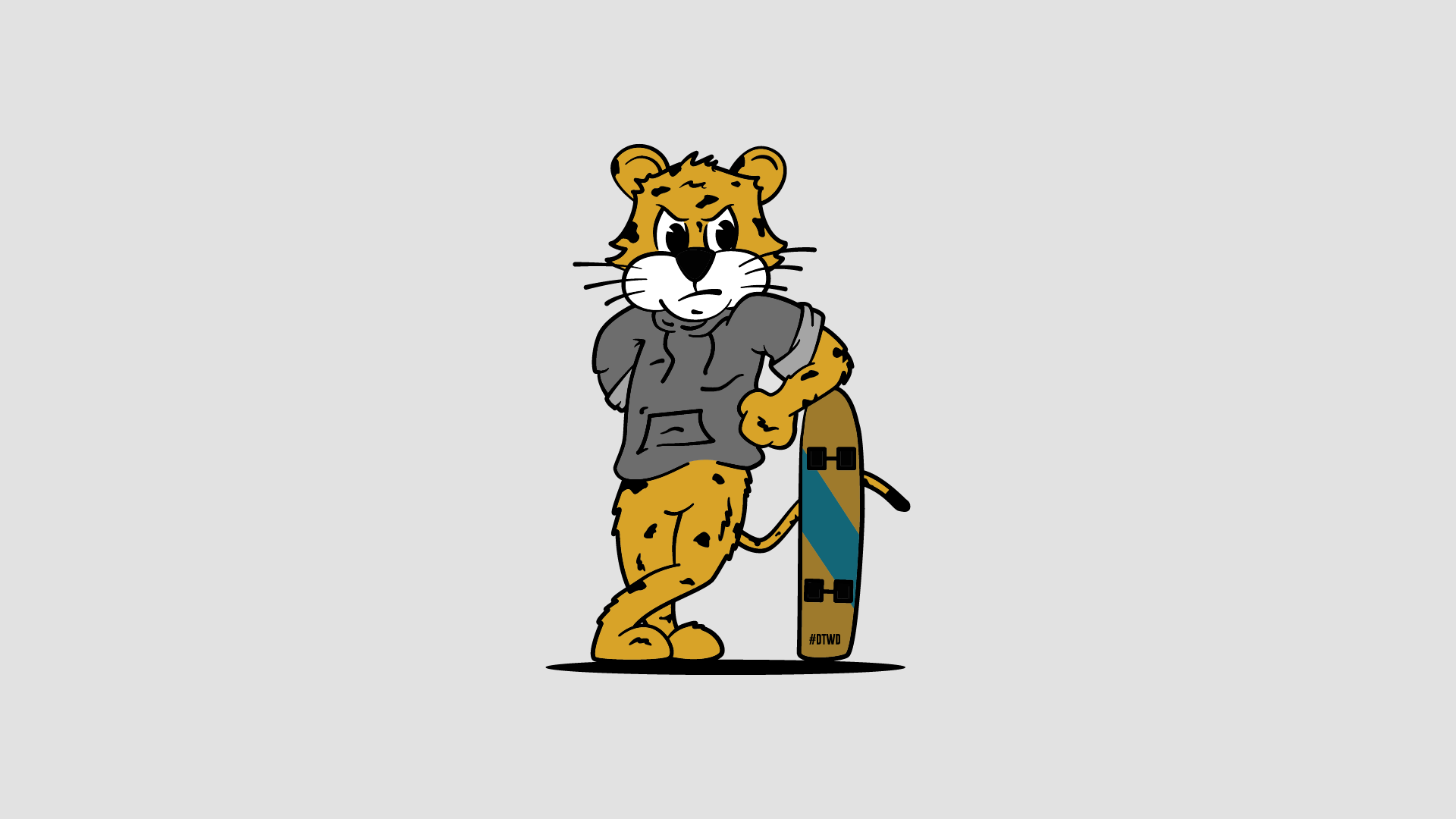
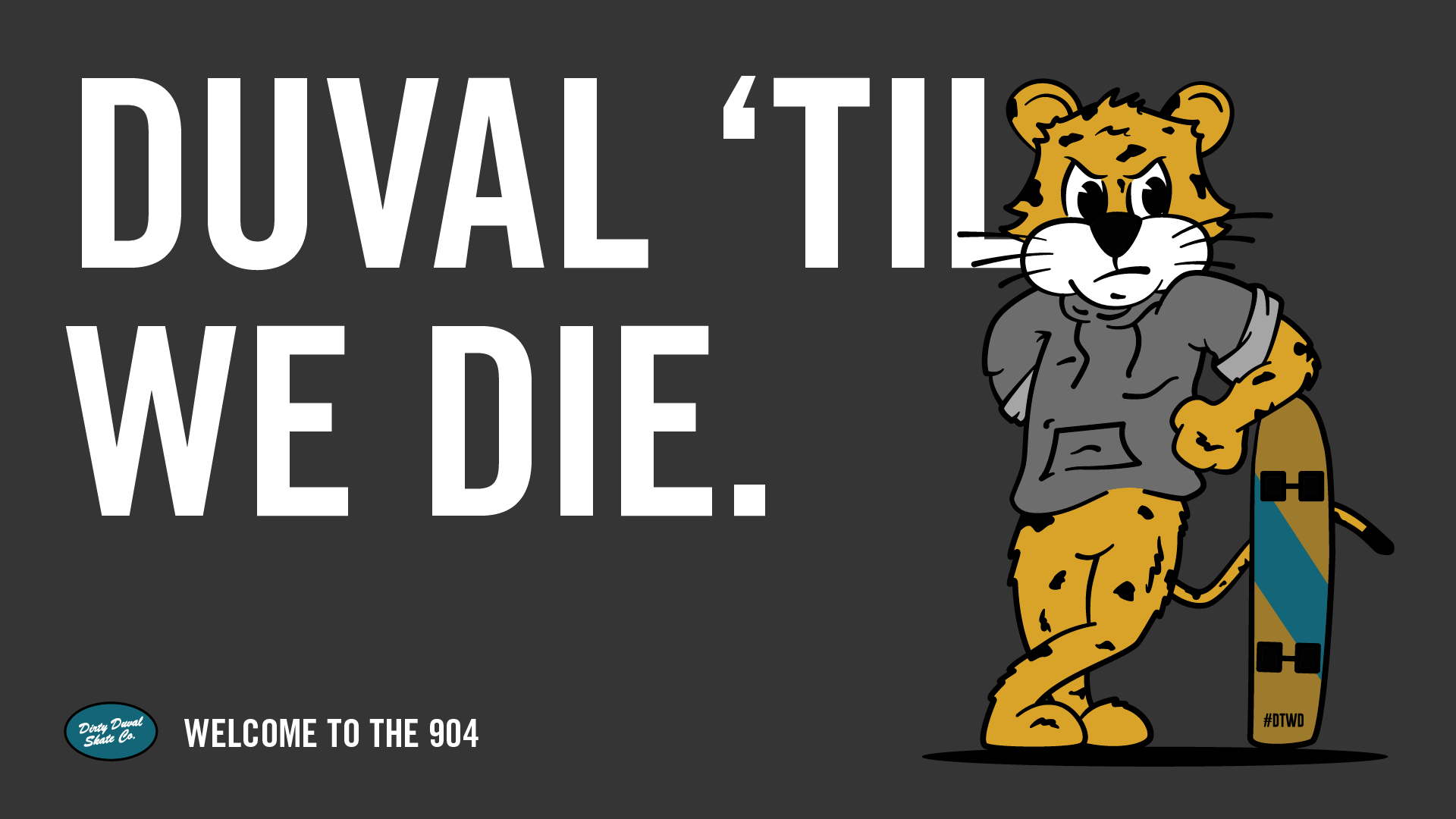
#DTWD (Duval Til We Die), a popular slogan among Jacksonville Jaguars fans. The cartoon jaguar illustration embodies the fierce spirit and unwavering loyalty of the Jaguars fanbase. Featuring bold and rugged lines, a dynamic pose, and the team's iconic colors. By analyzing this illustration's journey from concept to digital and printed deliverables, we highlight the power of characterizing the Jaguars mascot which enhances team spirit and fosters a sense of community among the Jags fans and Duval County residents.
ErvinJohn Icon Set
Client: -
Year: 2020
Services: Icon Design
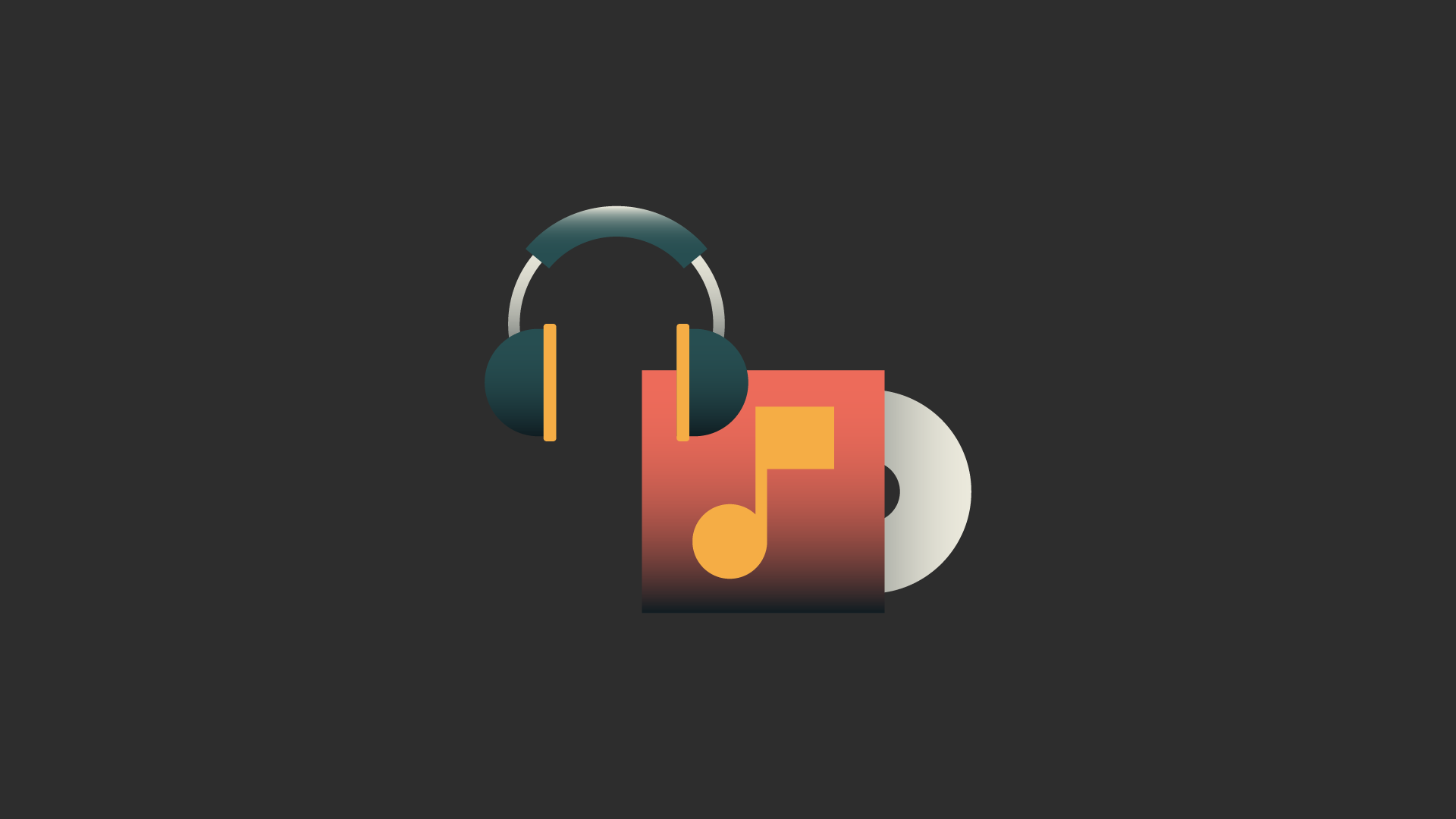
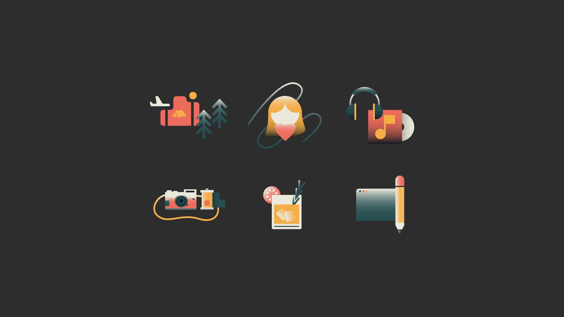
This icon set, developed by ErvinJohn, utilizes minimalist shapes and a cohesive color scheme and gradients to convey complex functionalities with simplicity and elegance. The abstract icon set is designed to streamline user experience across a suite of digital applications primarily showcase on social media. Each icon was crafted to be instantly recognizable, ensuring users understand it’s purpose. This brief case study explores the final digital renderings and it’s end use case. By focusing on usability and aesthetic appeal, this icon set exemplifies the effective use of abstract design in enhancing digital interaction and accessibility.





First Students
Client: First Baptist of SAKS
Year: 2021
Services: Brand Identity
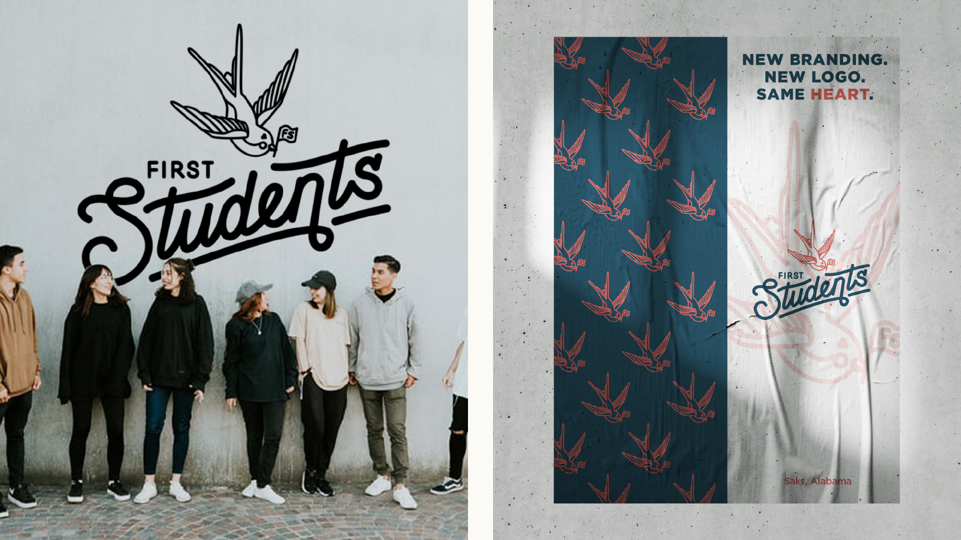
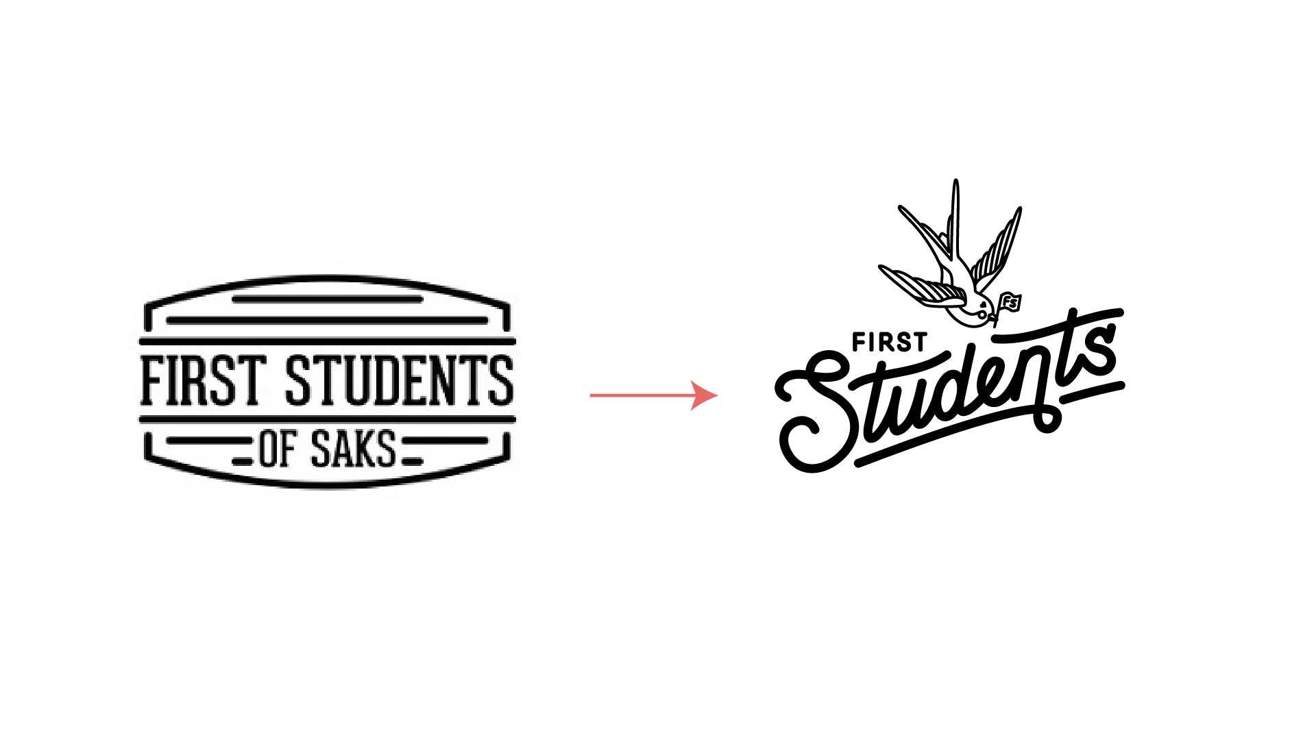
The new identity for First Students, the youth group of First Baptist Church of Saks, aims to resonate with teenagers while aligning with the church’s values. Featuring a modern yet organic logo, subtle color palette, and custom typography, this rebrand captures the humility and honesty of the First Students youth. The design elements were thoughtfully selected to be both inviting and relevant to the target age group, fostering a sense of belonging and community. This case study explores the branding process, including research, design iterations, and feedback integration, and evaluates the impact of the new identity on youth engagement and participation within the church and their community.


Florida Palms
Client: -
Year: 2020
Services: Brand Identity
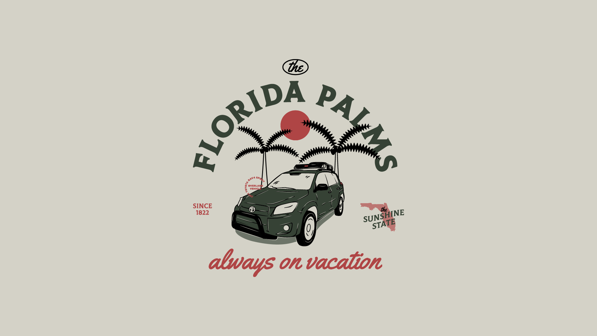
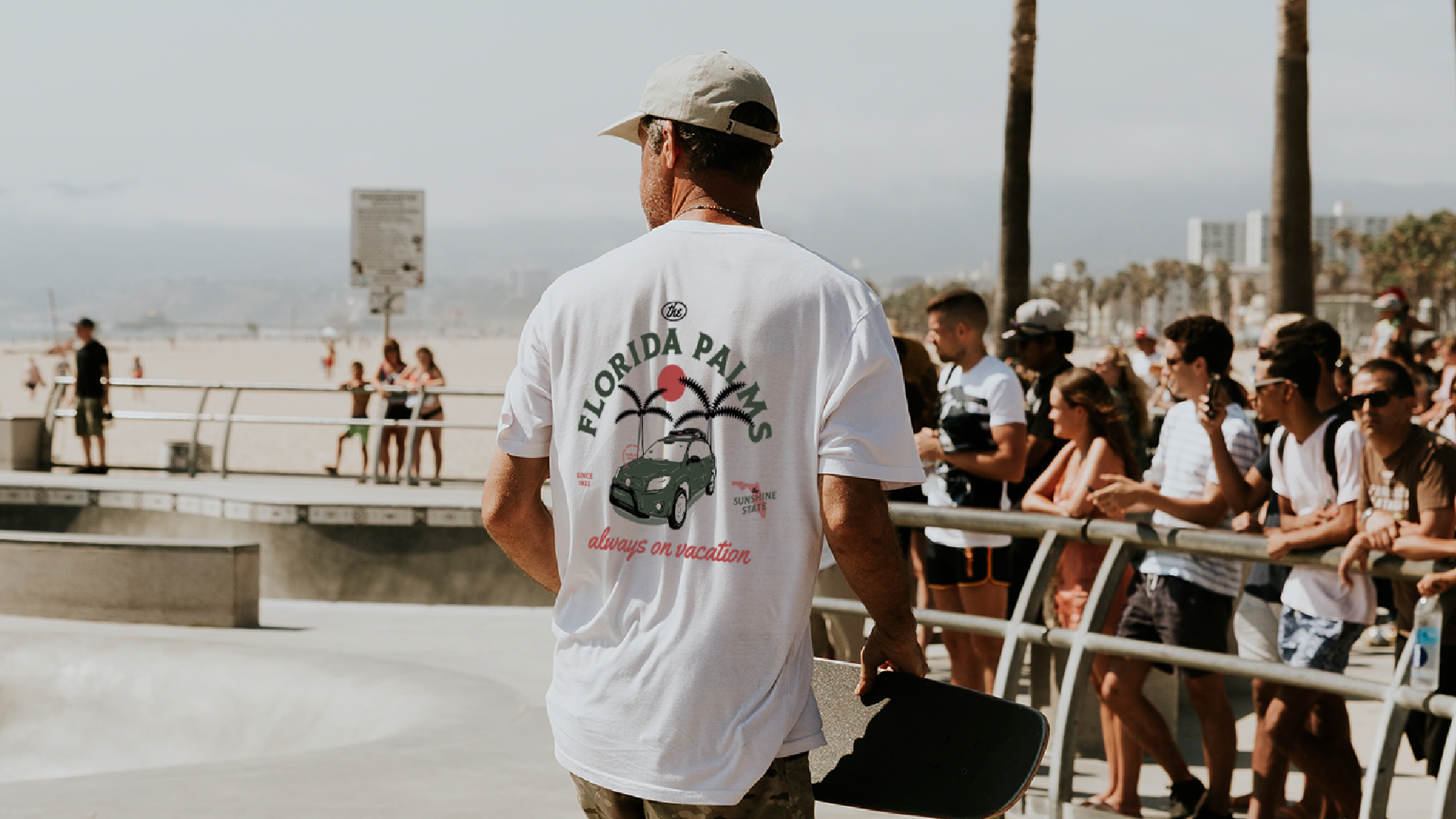
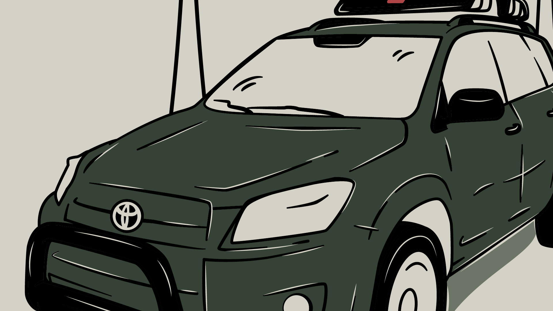
Florida Palms, a lifestyle brand celebrating the adventurous spirit of the Sunshine State. This illustration features a Toyota Rav4 adventure car set against a backdrop of swaying palm trees, capturing the essence of Florida’s scenic beauty and outdoor lifestyle. The graphic, rendered in neutral colors and detailed line work, embodies a sense of freedom and exploration. Primarily used in merch, such as t-shirts, sweaters, and tanks, this illustration lives on the shelves to inspire people to live a life full of whimsy in the Sunshine State.

Goolricks - Fredericksburg
Client: -
Year: 2021
Services: Illustration
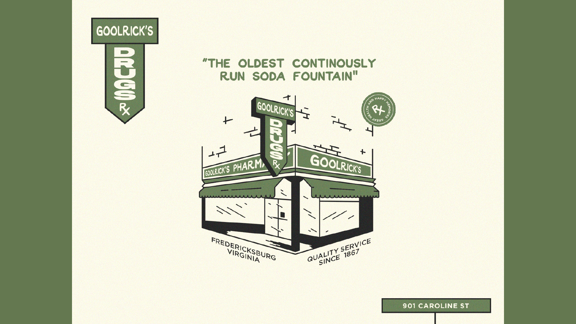
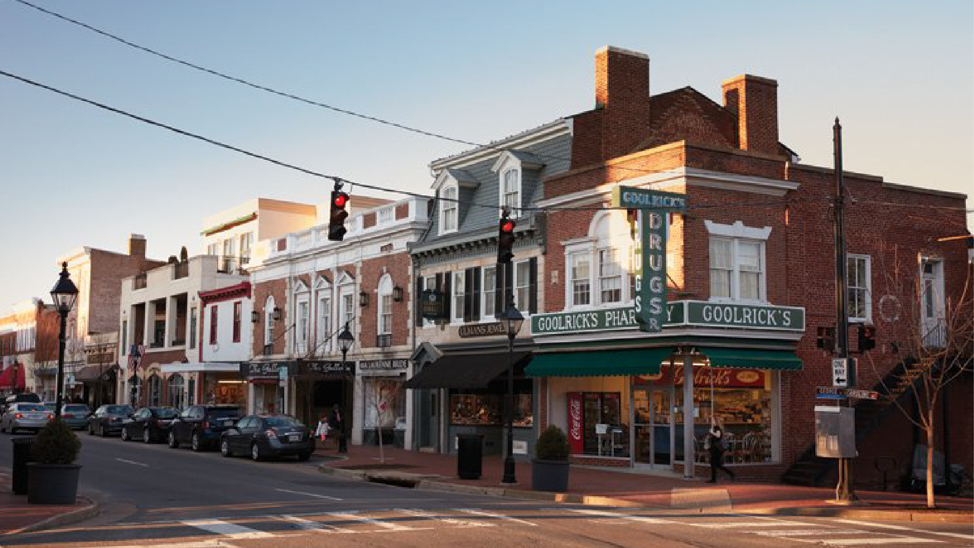
This illustration was created for Goolricks, a historic soda fountain and lunch counter located in downtown Fredericksburg, VA. It captures the charm and nostalgic essence of Goolricks Pharmacy, featuring its iconic storefront and original signage. Utilizing neutral, inviting colors and intricate details, the illustration pays homage to the establishment’s long-standing heritage while appealing to both locals and tourists. This illustration examines the inspiration, the selection of visual elements, and the integration of historical references.

Missionary Bush Pilot
Client: Ryan Farran
Year: 2022
Services: Brand Identity Illustration
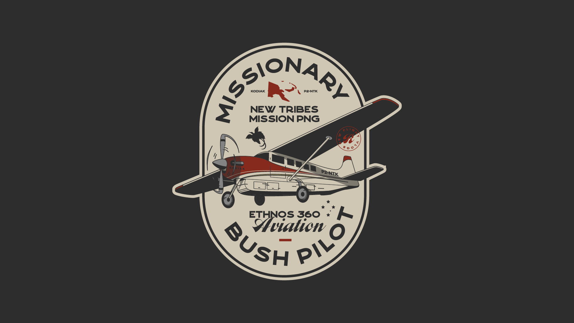
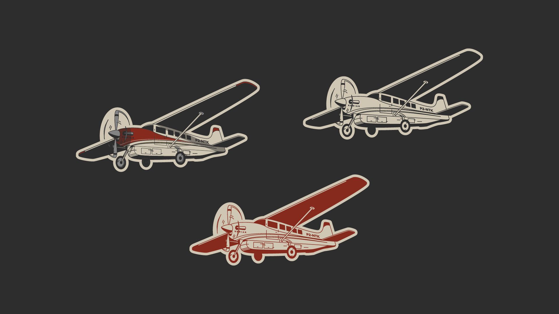
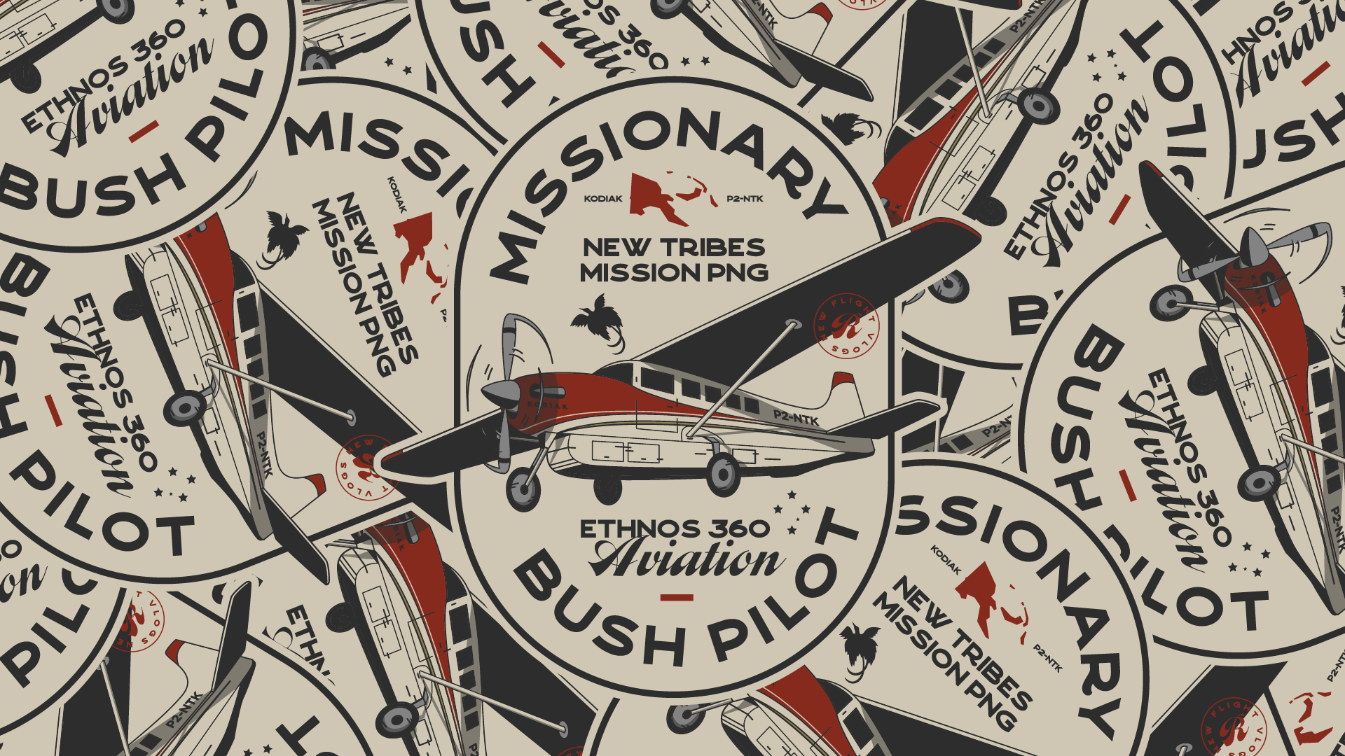
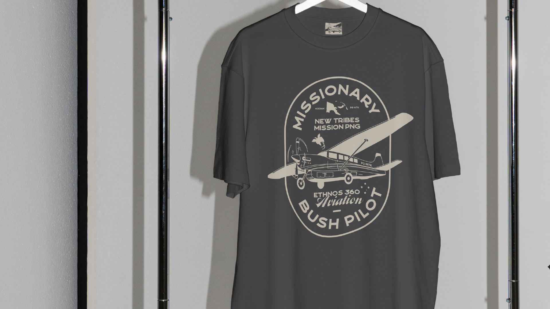
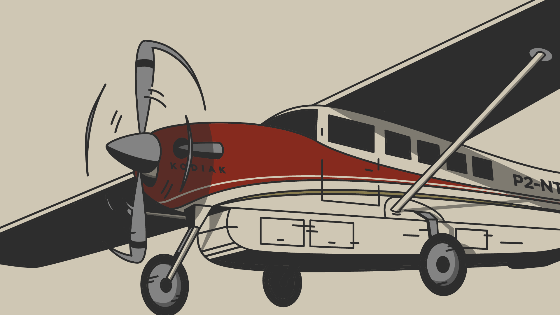
This case study explores the creation of a comprehensive brand identity for the christian YouTube channel Missionary Bush Pilot, which chronicles the faith-driven adventures of a pilot (Ryan Farran) serving remote areas - specifically in Papua New Guinea. The project encompassed designing a unique logo, channel artwork, and a range of merchandise that reflects both the channel's adventurous spirit and its christian values. The brand identity artfully combines an illustration of Ryan’s Kodiak 100 and bold typography, creating a cohesive and inspiring visual narrative.


Lunchbox Records
Client: Lunchbox Records
Year: 2021
Services: Brand Identity Illustration
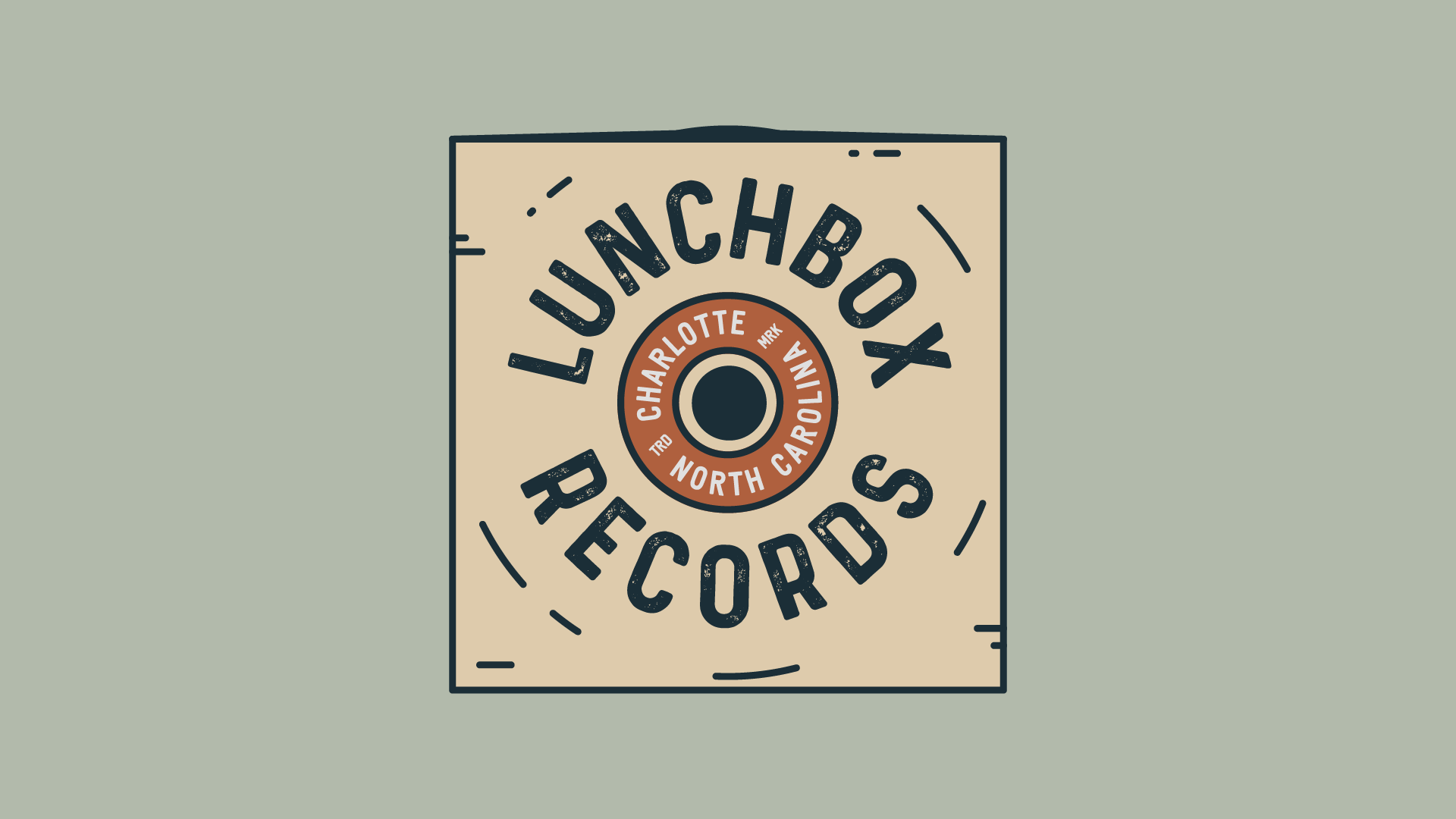
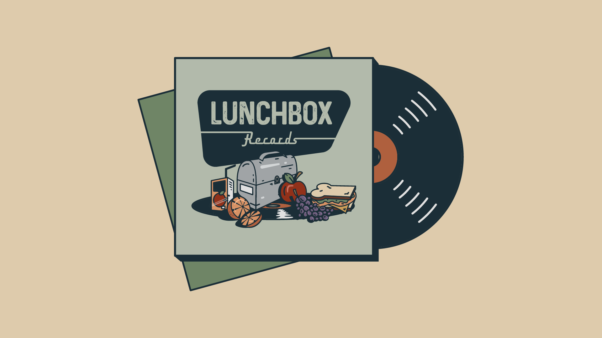
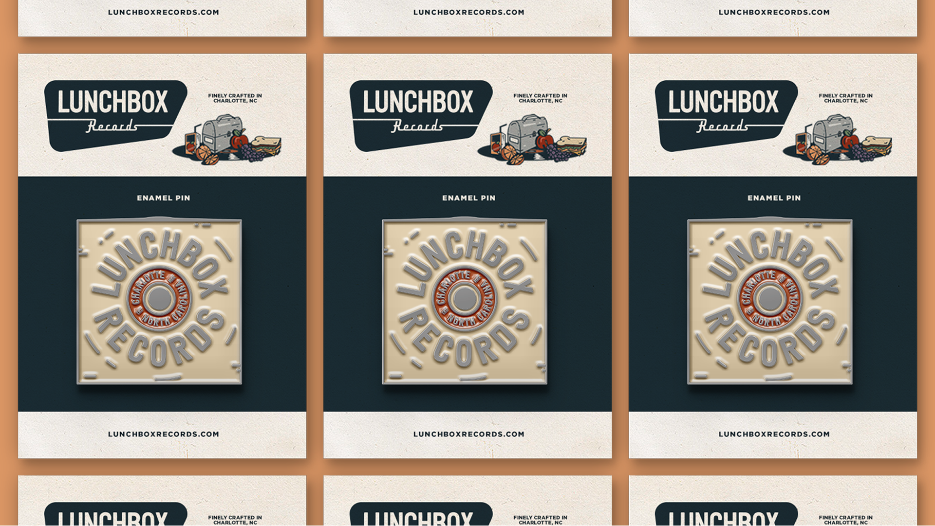
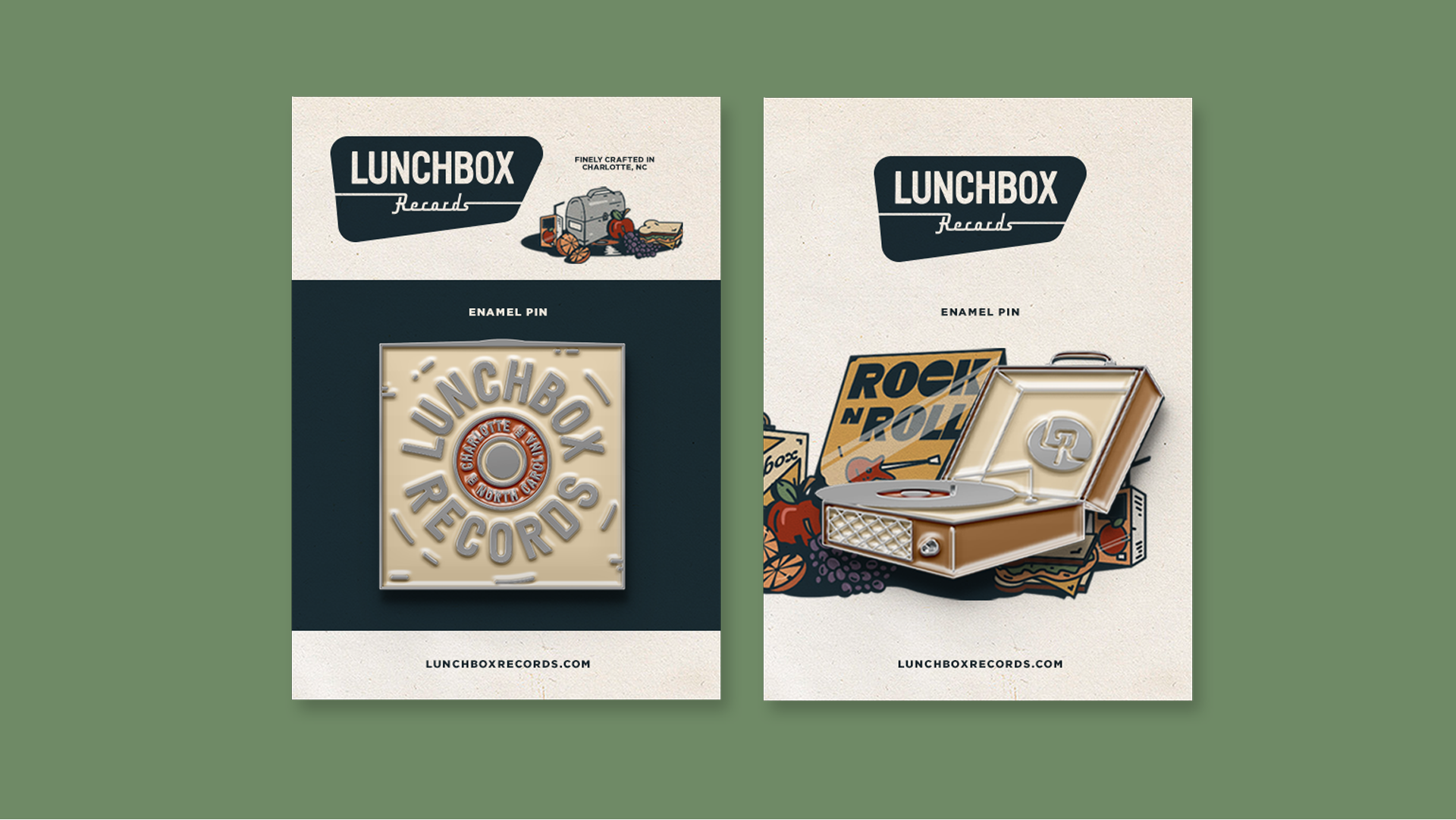
Lunchbox Records is a beloved local vinyl record store in Charlotte, NC, sitting right in the heart of Plaza Midwood. This project included designing an illustrated logo, digital renders specifically for social media, and promotional materials that encapsulate the store's eclectic and retro vibe. The brand identity leverages organic typography, muted colors, and nostalgic/vintage illustrations to reflect the rich history and culture of vinyl records. The case study dives into the concept sketches to the final delivered visual identity, and assesses the brand's impact on customer engagement and store recognition. It highlights how the new branding revitalized Lunchbox Records' presence in the local community, attracting both long-time vinyl enthusiasts and new customers.





North Glencoe Students
Client: North Glencoe Baptist
Year: 2022
Services: Brand Identity
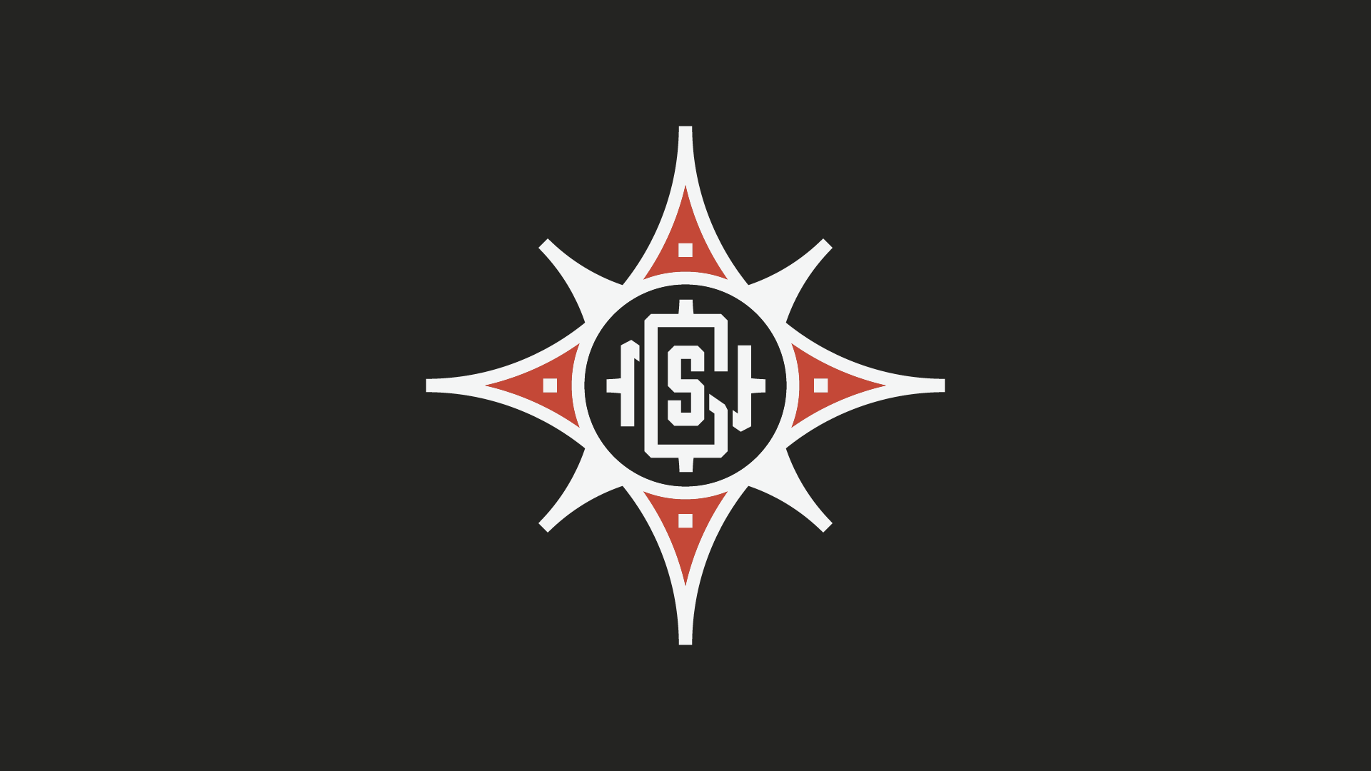
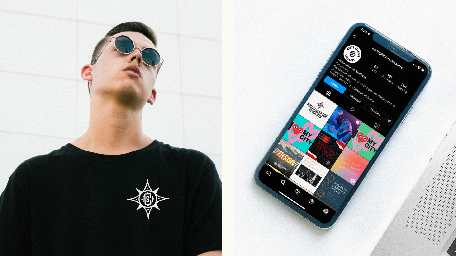
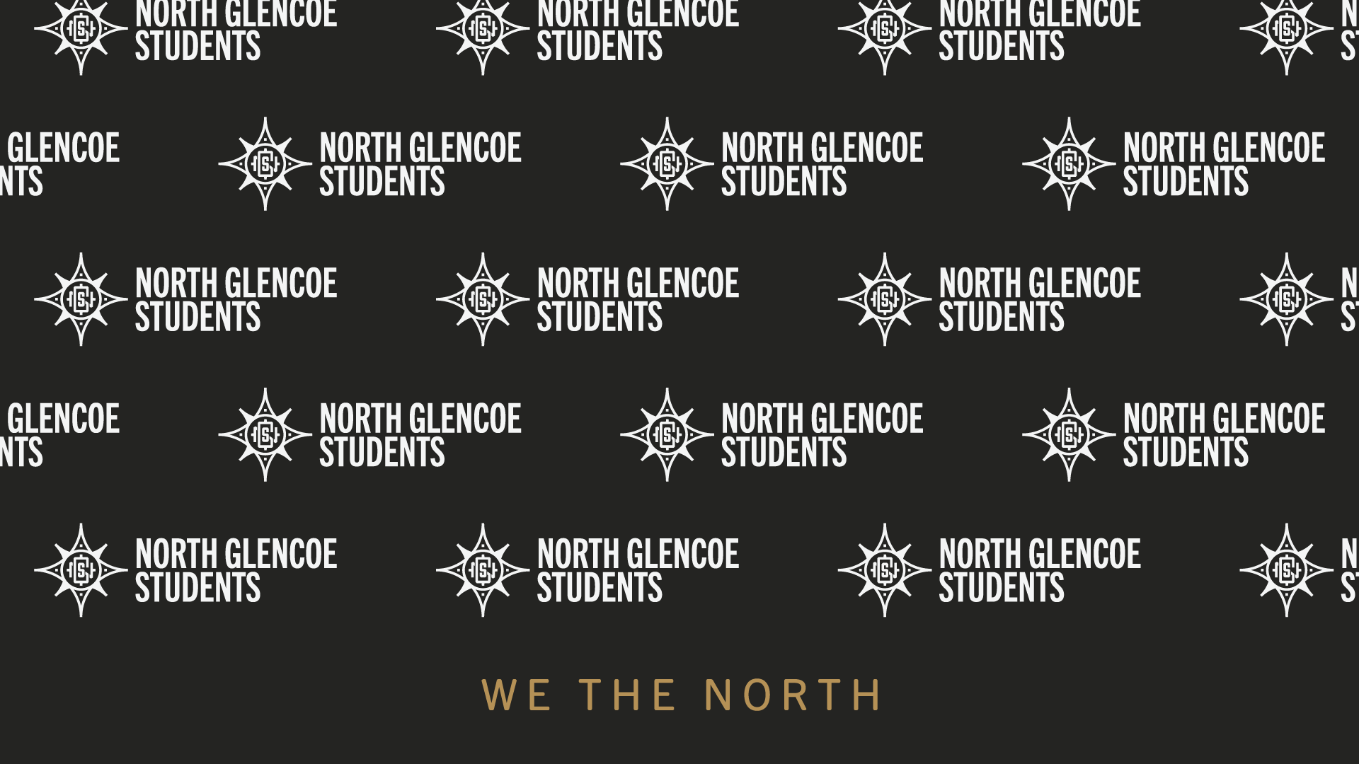
North Glencoe Students, the youth group of North Glencoe Baptist Church came to ErvinJohn in search of a rebrand that they were excited to rally behind. This project aimed to for a bold and captivating logo, cohesive visual materials, and promotional items that resonate with teenagers while aligning with North Glencoe Baptists values. The brand identity incorporates bold colors, modern typography, and dynamic patterns to capture the energy and enthusiasm of the younger generation. This case study highlights how the refreshed identity successfully fostered a sense of excitement and connection among the youth, enhancing opportunity to reach those in the community.




Red Pony Roasters
Client: Red Pony Roasters
Year: 2022
Services: Brand Identity Package Design
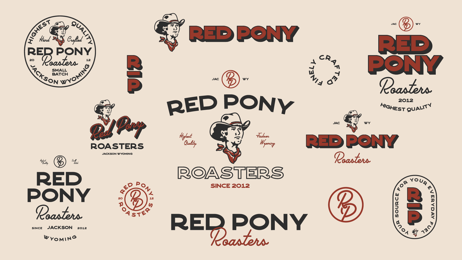
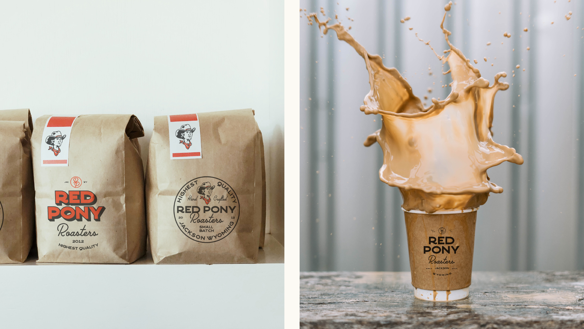
Red Pony Roasters is a local coffee roaster based in Jackson, Wyoming. This project encompassed creating a logo, packaging design, and promotional materials that reflect the company's commitment to quality and the spirit of the Jackson Hole community. The brand identity features rustic yet refined aesthetics, with earthy tones, hand-drawn elements, and a nod to the region's natural beauty. The case study explores the design process, from initial flash sheets to the final application across various touchpoints. It highlights how the cohesive visual identity has enhanced Red Pony Roasters' appeal to both locals and tourists, contributing to its growth and recognition in the competitive coffee industry.



Sonship Company
Client: Jonah Roberson
Year: 2022
Services: Brand Identity
This case study shows the creation of a meaningful brand identity for Sonship Company, a christian-based woodworking business rooted in Houston, TX. Inspired by Romans 8, the project aimed to develop a logo and marketing materials that embody the values of faith, craftsmanship, and community. The brand identity integrates symbolic elements such as faith motifs, woodworking tools, and timeless typography to convey a sense of spiritual depth and artisanal excellence.


